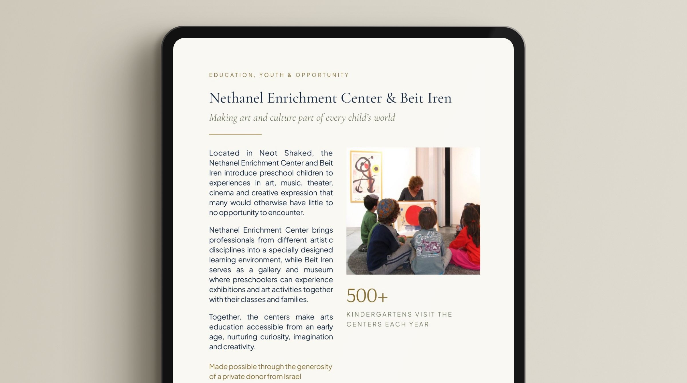
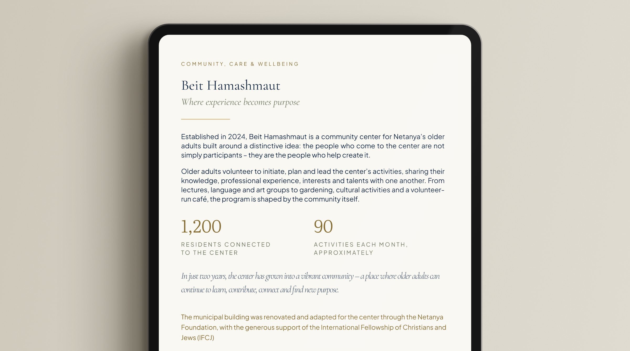
An impact portfolio for donors of the Netanya Foundation – showing where their money goes and what it built.
Dignified, magazine-style, and as readable on paper as on screen.
22pages and 10 spreads, A4 landscape
2formats from one source: print and screen
AIClaude Code working inside the Figma file
The direction
The Foundation chose the direction
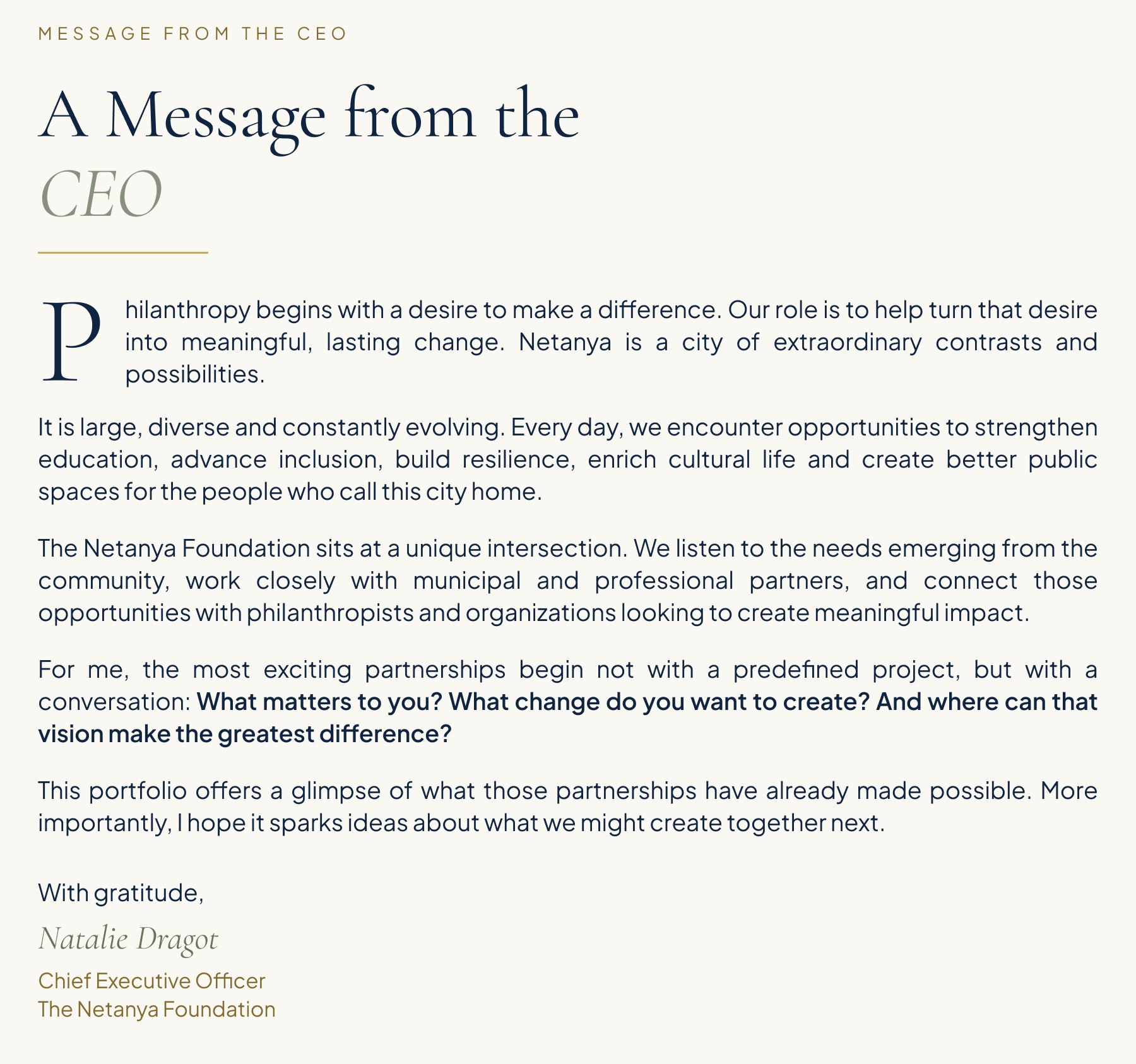
The Foundation’s CEO asked for this direction – navy, gold, a classical display face –
and drafted the first four or five pages herself, in Lovable. I rebuilt it all in Figma, tightened the design,
and took it from there: the format, the remaining pages, and everything it needed to hold up in print.
Portrait to landscape
Every spread opens like a magazine
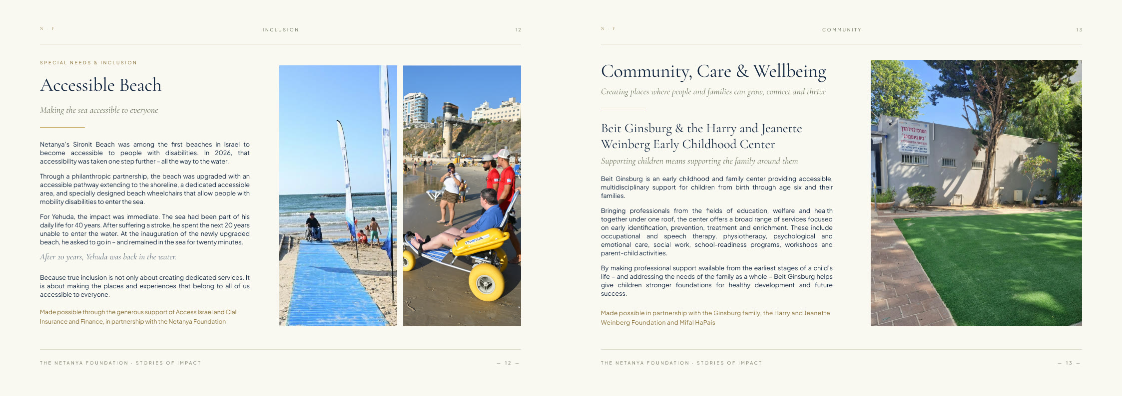
In portrait, it read like a document. I shifted it to landscape so every spread opens like a magazine:
text and image side by side, with room for each project to tell its own story.
Every page was rebuilt for the new format.
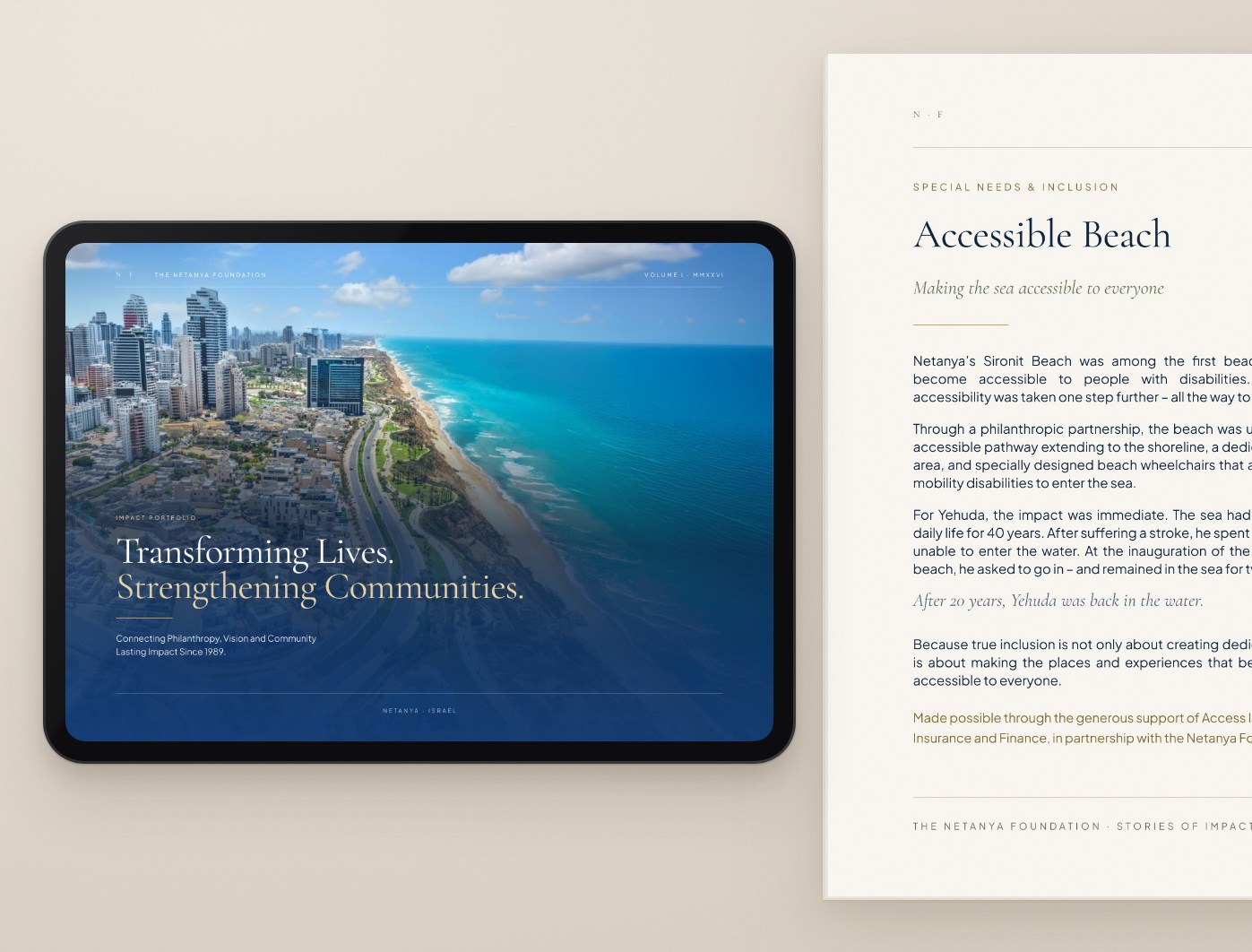
Landscape in print and on screen – the same page opens wide in both.
The system
A system, so 22 pages read as one
The Foundation’s palette and display face became a small system in Figma: colour variables and
six text styles that every page draws from. Two rules carry most of it – the gold splits in two,
one for ornament and one for words, and figures get a face of their own.
Netanya Foundation design system
Typography
Three faces, each with one job: a classical serif to speak, a quiet sans to be read,
and a separate face so a number never looks like a word.
AaDisplayCormorant Garamondfrom the Foundation’s draft
Body is 12.5 on 17 – chosen on paper, beside a newspaper, not on screen.
Colour
Navy, cream and gold came with the Foundation. The deeper gold is the one colour added
for a rule: gold that has to be read.
Brand variables
Navy · ink#0F2440Blue · dark pages#193A69Cream · paper#FAF8F2Gold · ornament#C9A961Gold · text#856A2EChampagne#E7D3A4Sage · muted#69725ARule#D8D2C4
On cream, the original gold reaches 2.1:1 – right for a rule, too faint for a sentence.
The text gold reaches 4.8:1, past the accessibility bar for body text.
Grid
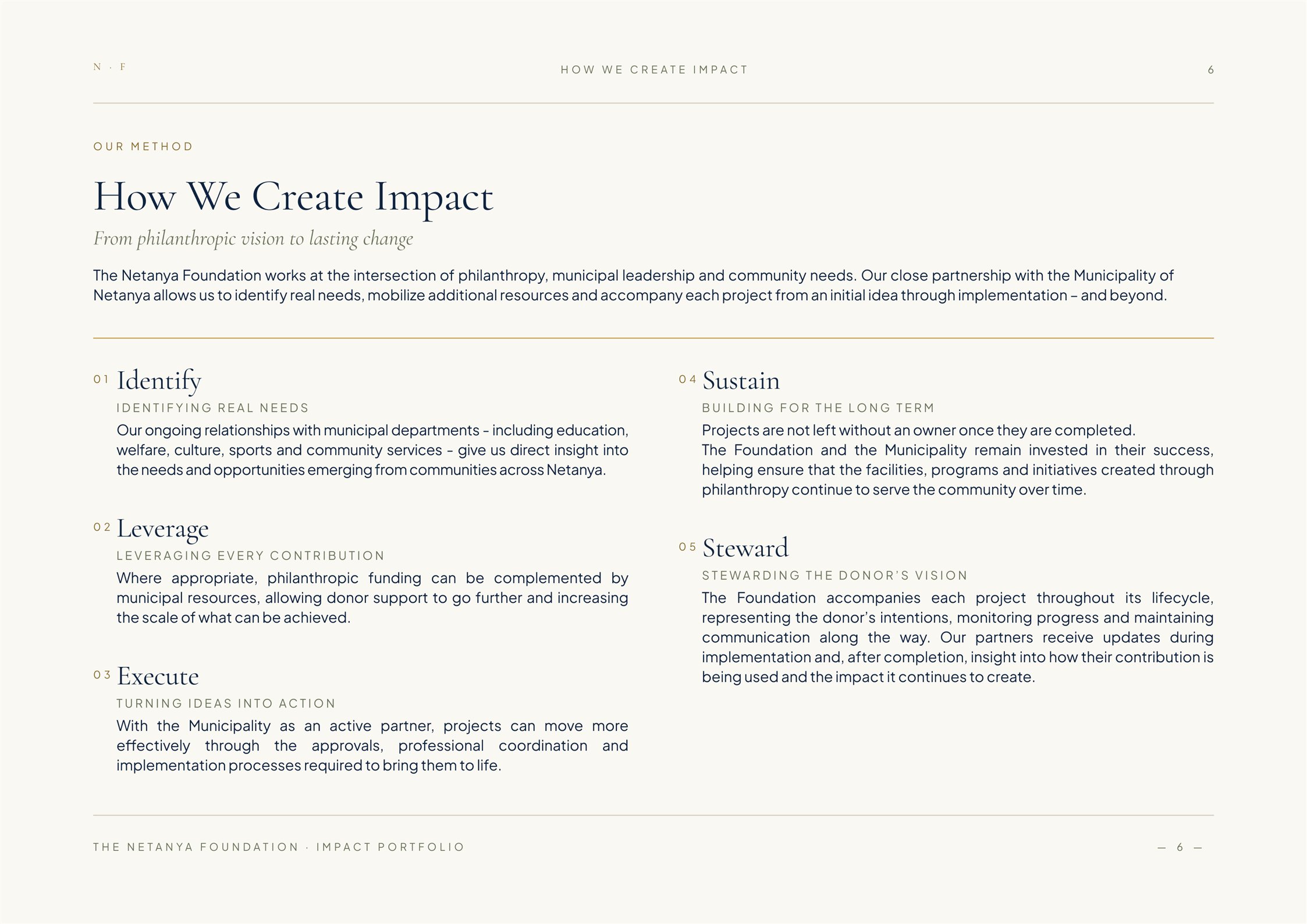
The same frame on every page: 80 margins, a header rule and a footer rule.
Inside it, columns open and close per story.
Page 6 · 1123 × 794 · margins 80 · the opening runs the full measure of 963, then two columns of 460 with a 43 gutter.
There is no grid layer in the file. The grid lives in the geometry – every page starts at 80 and ends at 1043.
Drawings
Drawings that wander across the pages
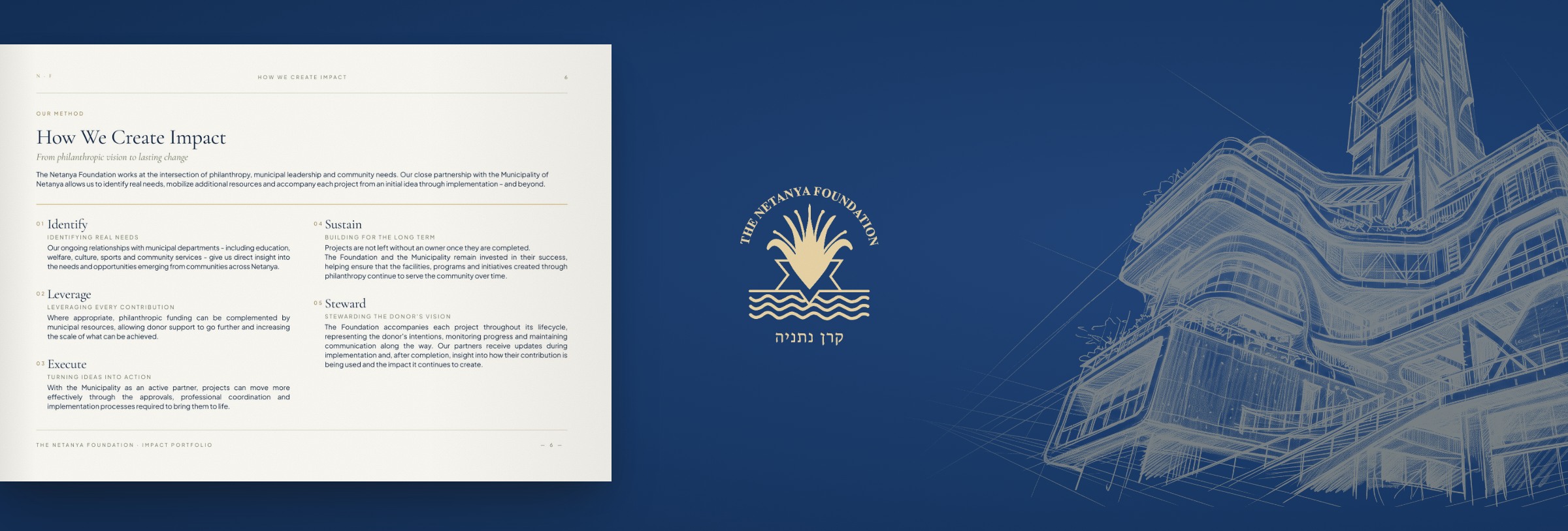
I added the line drawings. They are deliberately scattered –
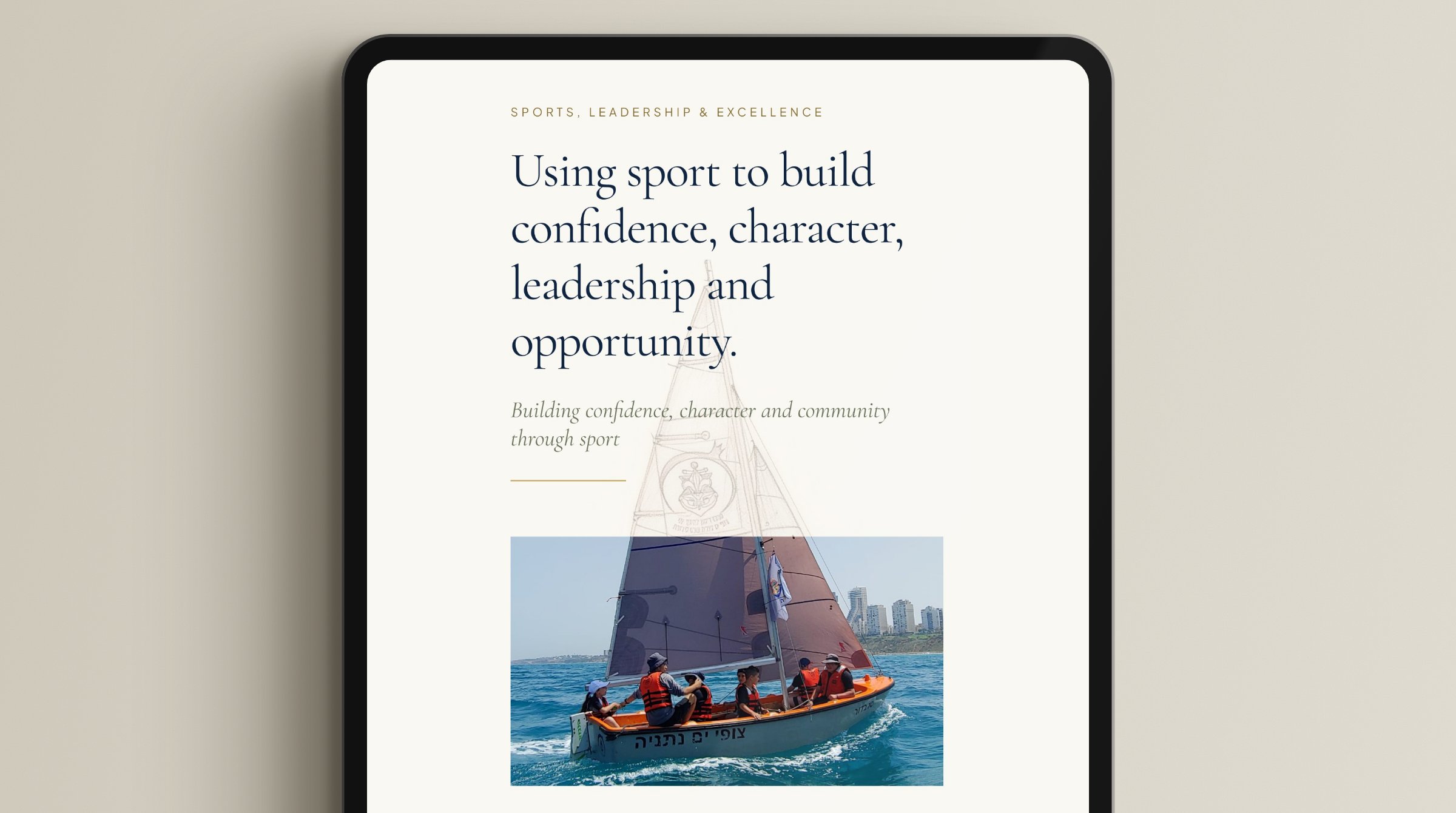
a piano, a sail, a building – rather than grouped on a single spread, so the reader keeps encountering them.
The sketch and the photograph meet at the sail.
Paper and screen
Typeset after printing beside a newspaper
Body text on a screen tells you nothing about body text on paper. I printed a test page beside a newspaper
and set the text from that: 12.5 on 17. The same source file exports twice –
a full-resolution file for the printer and a lightweight version for sharing and downloading.
Body text, 12.5 on 17 – the size that held up next to the newspaper.
The gold
Gold that stays dignified and readable
The Foundation’s gold is beautiful on rules and the cover, but too pale for words.
The gold splits in two: the original for lines and ornament, and a deeper gold for text,
reaching 4.8:1 on the cream page. Numbers are set in Literata, so a figure reads as a figure.
Figures in Literata and the closing credit, both in the deeper gold.
Where the money goes
Every story ends with who made it possible
A donor reads this to see what their contribution became. Each story page carries the place itself,
and ends with a line, in gold, naming who made it possible.
Credit
Who did what
The Foundation’s: the direction – the palette, the display face, and a first draft of four or five pages.
Mine: the landscape format, the remaining pages, the drawings and background images, and the print system.
Shown with the Foundation’s permission.
Built with Claude Code working inside the Figma file – measuring contrast,
checking every page, making precise edits. The design calls stayed mine.